Alice Twa and Ollie Williams·
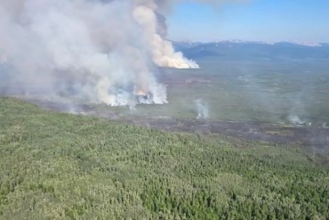
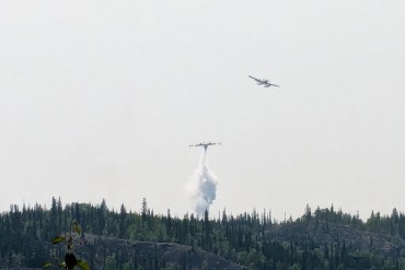
The wildfire north of Wrigley continues to edge closer to the community, NWT Fire said on Monday evening, and a hot, dry day is expected on Tuesday.
Advertisement.

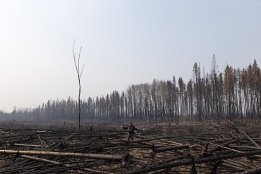
This page contains Cabin Radio's coverage of wildfires in the NWT. Use our map to get a live picture of the situation and read our latest reporting. Share this map on Facebook (avoids Meta ban) by copying and pasting this link: https://cabinlinks.ca/r/dd1a32df2c42
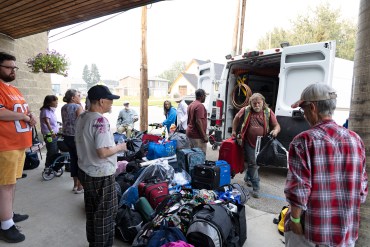
Get updates from the NWT's wildfire agency on the GNWT's website. You can also consult the Maca public safety page for updates about evacuations or other safety alerts.
Firms – wildfire hot-spot tracking from Nasa
Copernicus Browser – high-quality satellite imagery updated every one to two days
Zoom Earth – lower-quality imagery updated more often (every 10 minutes)
FireSmoke.ca – forecasts for smokey weather