


Advertisement.
We’re about to enter the fourth year of a drought across large parts of the Northwest Territories and the picture isn’t really improving.
This week, the NWT government issued a bulletin summarizing the latest data from water gauges across the territory.
Charts produced by the GNWT using that data show how water levels have changed over time. On this page, we’ve selected 10 charts that tell the story.
While water levels in rivers and lakes aren’t the only indicator of drought, they are an obvious way to understand how much water might be in the surrounding environment.
Advertisement.
Advertisement.
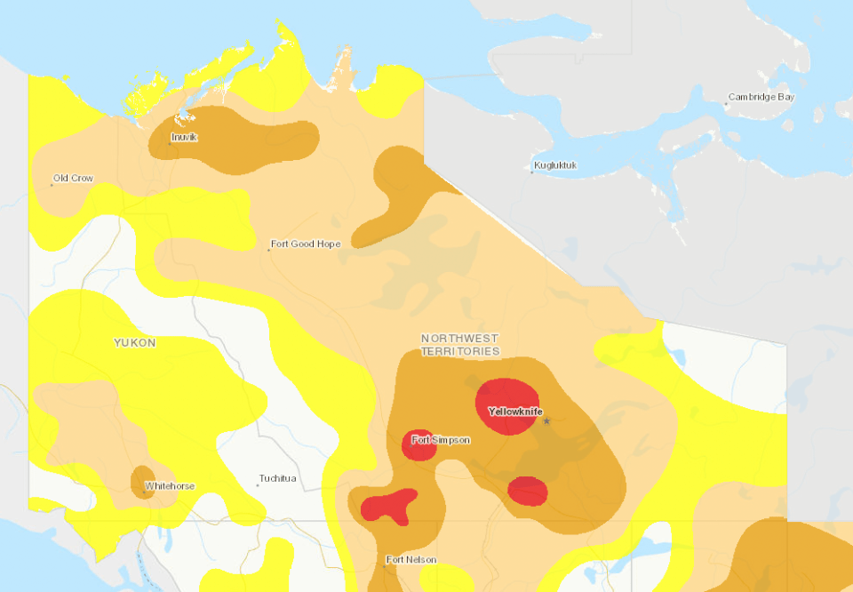
The big picture from the GNWT is that any recovery from the current drought has “mostly been limited to small rivers and lakes,” and major rivers like the Mackenzie or lakes like Great Bear and Great Slave are still very low.
NWT government hydrologists summed up levels on the Mackenzie River, Great Slave Lake, and the Slave, Liard and Hay rivers as “well below average” for this time of year. Great Bear Lake is at its lowest water level recorded for this time of year.
In August, NWT communities were mostly hotter and drier than average, this week’s bulletin reported.
Meanwhile, in northern BC and Alberta – the source of a lot of water that flows into the NWT – recent precipitation is reported as “below to well-below average.”
Advertisement.
Advertisement.
Taken together, that makes it hard to see how the drought will shift any time soon.
Here are 10 charts showing water levels in key NWT rivers and lakes.
To understand the charts, all you need to know is:
- light blue is last year’s water level;
- dark blue is this year so far; and
- the grey summarizes data from earlier years.
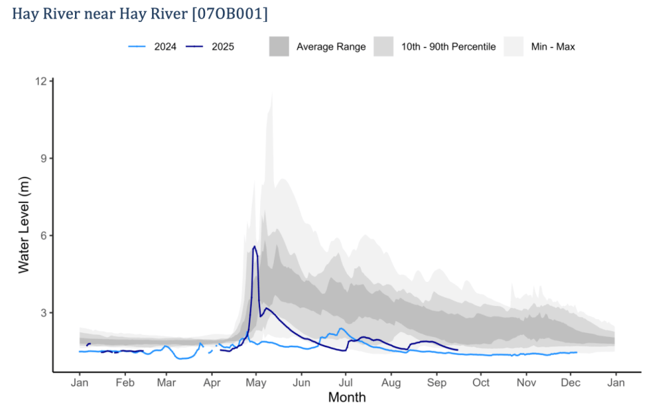
We’ll start in the South Slave.
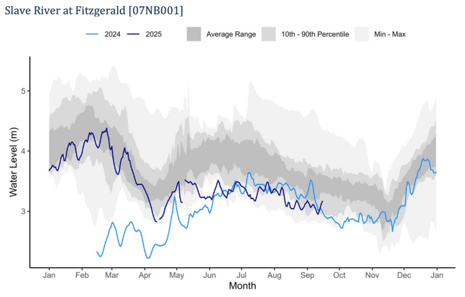
These charts show the Slave River briefly made it back into the dark grey “average range” earlier this year, but has sunk back to levels that are lower than 2024’s at times.
The Hay River near the town itself remains very low, though slightly higher than it was for most of last year.
Now, let’s look at the Yellowknife and the North Slave.
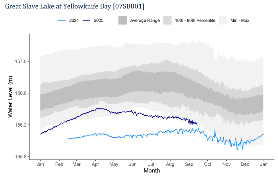
Great Slave Lake’s water level in Yellowknife is still near the bottom edge of anything we’d seen prior to last year.
Advertisement.
Advertisement.
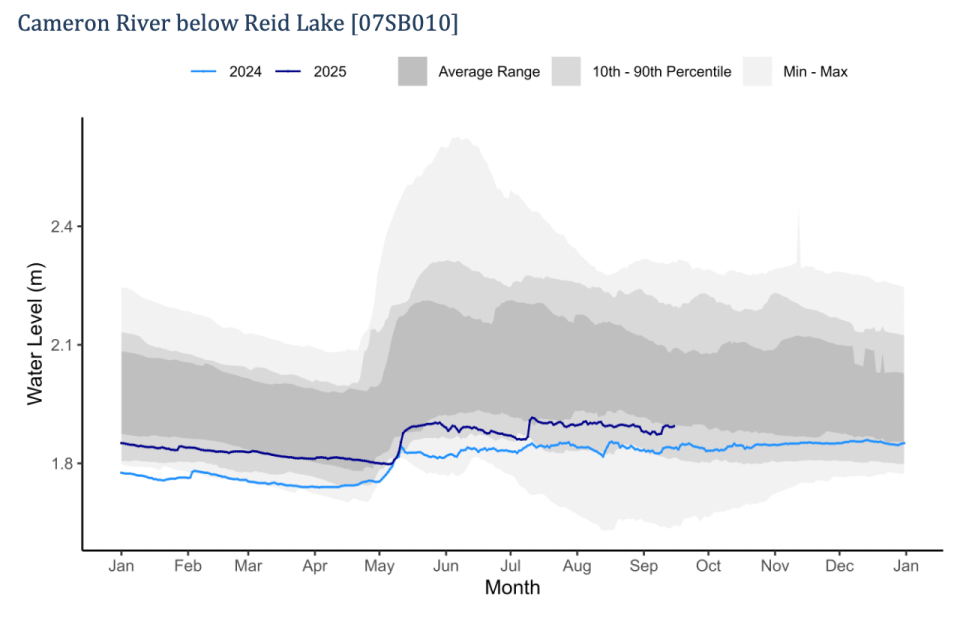
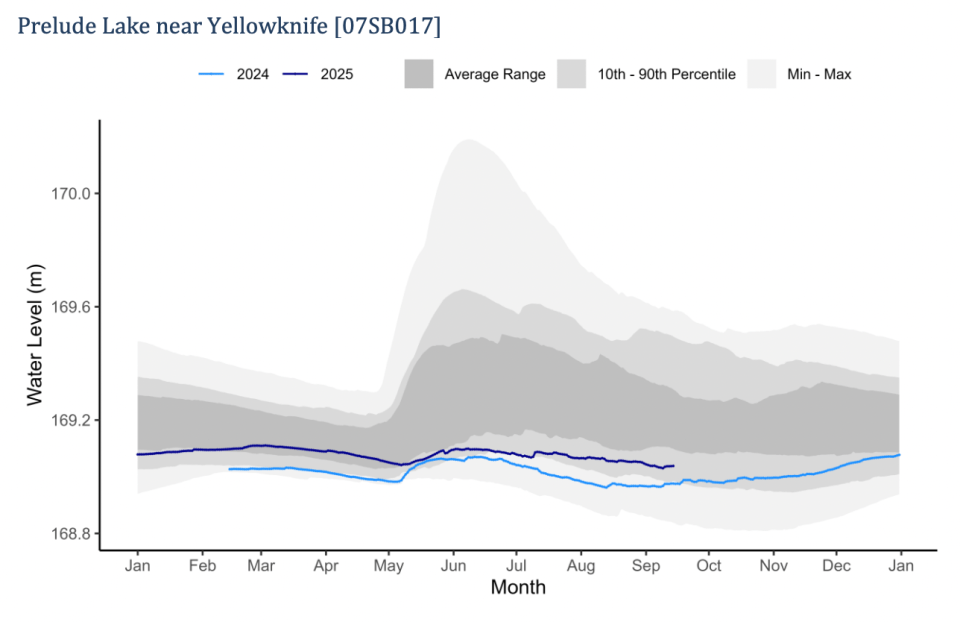
The Cameron River is at the bottom end of its usual average range, while Preluade Lake remains low.
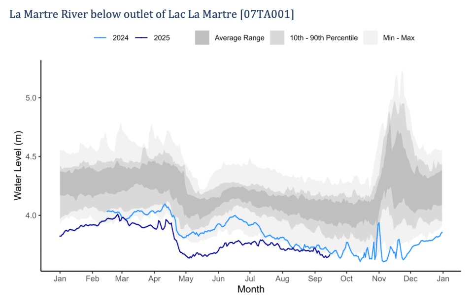
The La Martre River outside Whatì is lower than it was last year.
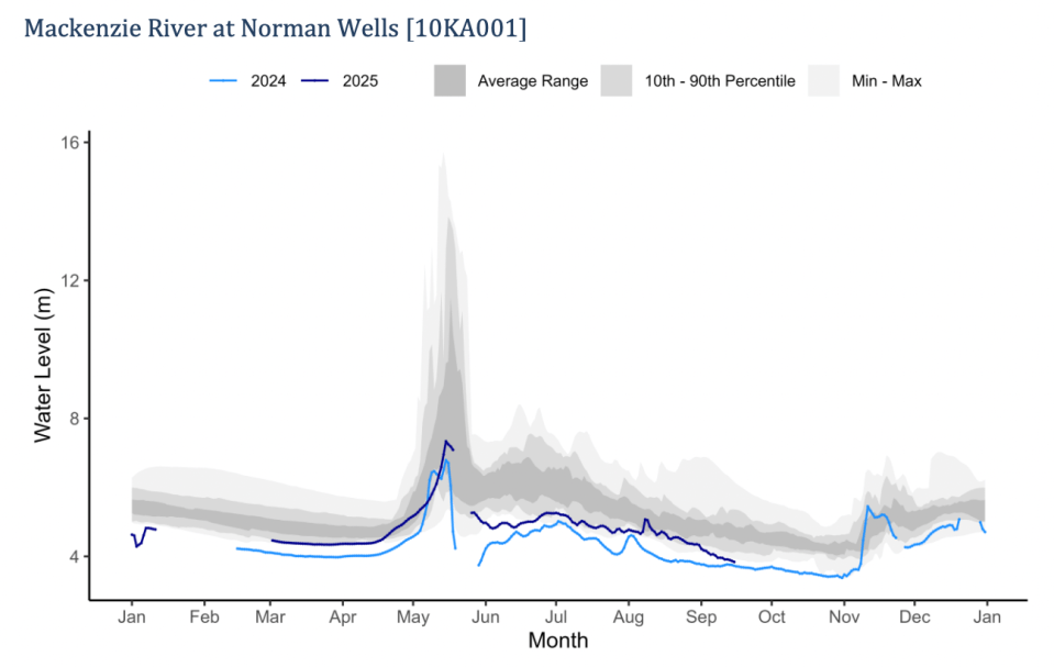
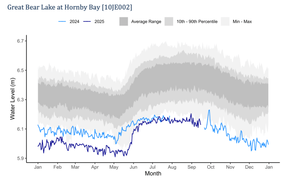
Lastly, let’s look at the river systems flowing up from areas like the Dehcho into the Sahtu and Beaufort Delta.
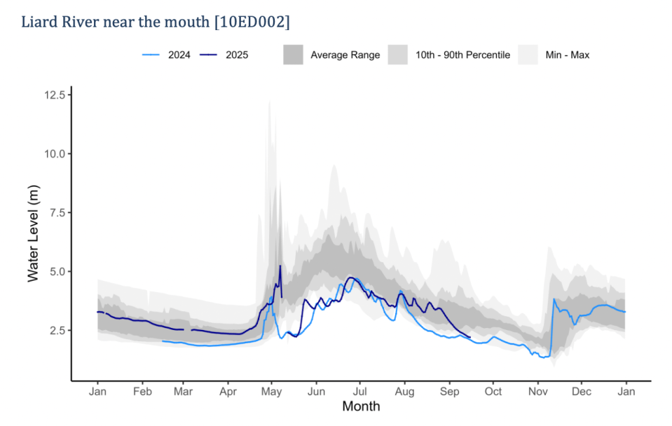

The Liard River is again extremely low near its mouth outside Fort Simpson, and the picture looks roughly the same for the water gauge in Fort Liard itself, too.
The Mackenzie River at Norman wells is a little higher than last year but not by much. Great Bear Lake is as low as it’s ever been.
The Peel River has been an outlier for some time. The Peel’s drainage basin has received much more water than other areas and the Peel’s levels have been higher for years, but even the Peel’s readings near Fort McPherson have dropped below average lately.